
First, full disclosure: I am 8,143 miles away from achieving Platinum for life (FOR LIFE) frequent flyer status on American Airlines. That means I’ve flown almost 2 million miles with the airline since 1995. I’ve been a loyal customer despite luggage loss, two emergency landings, countless non-weather-related delays, and rude flight attendants. American has delighted me more often than it has disappointed me. So, when I was making my way through all my unread email this week and came across one the airline had sent last week with the subject line “See How We’re Evolving, Inside and Out,” I opened it.
I reacted to the contents of the email not as a customer, but as a marketer with years of brand management experience.
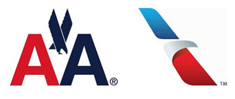
American Airlines has retired its 40 year-old logo for a new one because: “Our changes on the outside reflect how we’re evolving on the inside. Our new logo and the refreshed exterior of our planes represent more than a change of symbol, but a symbol of change in our path to modernize and innovate.”
I love it when something like this happens, because I get to put myself in the shoes of the marketers who had to go through the trials and tribulations of such an endeavor.
I’m not going to get into FutureBrand‘s design of the logo and livery in this post. I could dissect the pros and cons of the design for hours. But, boy, would I love to see all the iterations that the marketers at American went through with their agency on this!
During the last few years, American Airlines has not been living up to its brand promise of “We know why you fly.” If they knew why we fly (and cared), the airline would not be ranked last in customer service, and it would not have fallen from the #1 airline in the US to #4 according to the USDOT in the last 4 years. One of the reasons for this decline is the airline’s aging fleet, which experiences mechanical breakdowns more frequently, leading to increased cancellations.
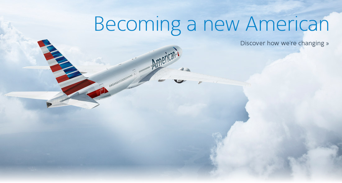
The email I received proclaimed that the airline is “bringing you hundreds of new planes, cutting-edge technology, and more ways to stay comfortable and connected throughout your travels.” I clicked through to a video of the CEO talking about modernization of air travel, the new carbon fiber 777 aircraft (very nice!) that enter into operation this week, and the unveiling of the identity and livery to an inspirational symphonic crescendo, complete with American flag and Statue of Liberty fly-by.
It was a risk to radically change the logo, and I can imagine and relate with great empathy to the arguments on both sides. On the one hand, the recognizable 40 year-old logo presumably has great equity and history. Customers are comfortable with it and relate to it; therefore, there is no reason to change it. On the other hand, if any industry needs a brand refresh, it’s the airline industry, so American got ahead of competitors to shatter the status quo. The arrival of the new fleet made timing a “now-or-it’s-more-expensive-to-repaint-all-those-planes-later” a pragmatic decision criteria.
Another dilemma is that American is a company in financial distress. It is in bankruptcy and in talks to merge with a competitor. Employees have taken pay cuts. They are running out of “extras” to charge customers. A brand change of this magnitude is expensive, in the millions of dollars. Is a re-branding effort the right thing to do when a company is struggling? I know a few of us who have been through exactly that. It’s a very hard decision.
One belief I’ve held as a marketer is that sometimes marketing has to drive and create great change in order to alter the culture of a company for the better (or even for survival). I think that may have been at play here. Making such a radical change to the visual identity and livery – thereby signaling big change to the market and customers – will now force American Airlines to change, to deliver on the promise the new logo symbolizes. Should American have waited to have more of the new aircraft in service, to have improved on-time stats, to have decreased cancellations, to have completed the merger, to have a firmer financial footing before launching the new logo? I don’t think so. I think the need to reinvigorate the company was far too great and that marketing had to step up to a very difficult role in leading a risky and probably unpopular initiative in an overall effort to steer the airline in the right direction.
What do you think? Would you have fought for the iconic, respected logo or would you have fought for a change? Share your thoughts by leaving a reply.

I recently got a new tattoo – its big and awesome and I love it….but for better or worse, I’m still the same person 🙂
LikeLike
Hi Teresa~ Nice post- but I disagree that a logo change will force a culture change at American. This legacy carrier’s internal issues are way more than paint-deep. Nice to hear that you have such brand loyalty to them, but those that have elite status are usually the ones that do. Try riding in coach a few times to really get the full experience! Of course I wish them well in their attempts to turn the corner…
LikeLike
Thanks for the comments! I’m not saying I think this strategy will work. I’m dissecting their motivations for it. I think it took guts and has a high chance of failure, so I respect the very difficult decision it was. I can imagine the many emotional debates (yelling matches) that occurred.
LikeLike
Definitely a gutsy move to change their iconic livery, and I do think it’s visually a change for the better. Can you imagine if they tried crowdsourcing?
LikeLike
Although I have half the miles you do (and they seem to be wanting me to catch up!), I first saw the new image on a TV while at the gym, so it was viewed without the marketing spin, just the image. My first reaction was, “wow, that logo AA uses has never changed in my lifetime, its about time.” I think all their competitors have undergone numerous facelifts, so there might be some ‘us too’ dynamcs going on. Also don’t discount this is a move in advance of the merger with US Air. I think we might just be seeing the logo of the combined airline. Sorta like new bangs! 🙂
LikeLike
Paul, that’s a great point. I did read that AA and USAir already agreed this would be the new logo of the combined airline. That would explain why the tail livery is different from the logo. That is well-executed.
LikeLike
I’m gold for life Teresa but quit flying them after spending almost $500 one year making flight changes. Except for international travel, they won’t get my business until they change their ridiculous fees. And change how they treat their employees. You and I have watched that horror story for years.
LikeLike
This is an airline that needs to.go the way of PanAm. It has no idea how to treat its customers, to establish brand loyalty. I suspect most American people only fly it as it has American in the name and so many Americans are agrophobic. They might trust British Airways but Korean Air, Iberian, etc … Not sure they are safe …
My experience of AA has been terrible every flight since the late 90’s. I had 750k miles and a platinum card, cut the card in half and mailed it to their company President. Not flown them since.
Good luck with their new brand, perhaps they felt they needed to do it to shake off the anti-customer culture that all their employees excel at.
The reason why we fly, because we have to. To be treated like cattle, prodded through gates, forced into line, fed swill …
I’ll get off my soapbox now, … Until I have to fly again.
LikeLike